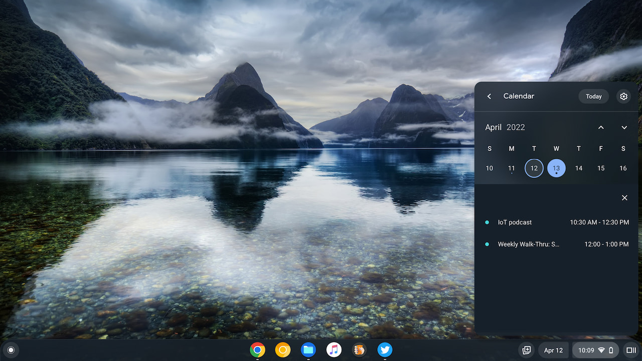
I recently covered the experimental Chrome OS calendar that first appeared in Chrome OS 99. Once enabled, you can view a nice Calendar widget by tapping the date on the bottom right of your Chromebook. Chrome OS 100 added more functionality so you can view calendar events. In the most recent Google Chrome OS 102 Dev Channel update, which I received earlier this week, Google made a small change to the Calendar widget. After using it, I can tell you it makes the experience much better.
What’s changed with Chrome OS 102?
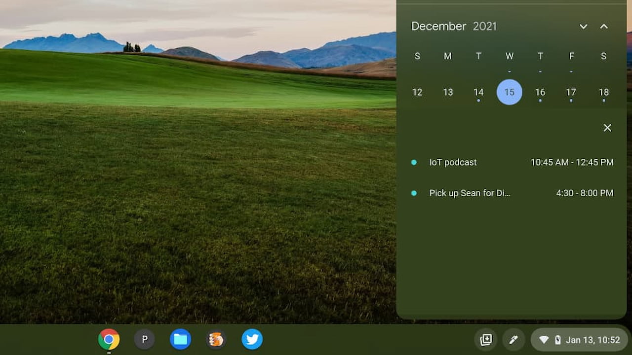
Chrome Unboxed first noticed this change in the Chrome OS 102 Canary Channel. Essentially, Google has split up the date from the original Quick Settings icon. The Calendar widget, therefore, is now separated from the other often used icons that it used to share space with.
That might appear to be a ridiculously small change to highlight. And on the surface, from a user interface and design standpoint, it is. From a user experience perspective, however, this is such a big improvement.
Over the last three months, I’ve lost track of how many times I clicked the date when I really wanted to click the Quick Settings. Seriously, I think I’ve only correctly clicked Quick Settings a handful of times since January. And it’s frustrating every single time I don’t. That’s compared to the hundred or so instances that I actually wanted to see my Chromebook settings.
With the new design, the date is no longer in the right-most corner of the display. Now it’s to the left of the Quick Settings. And there’s a small separator between these two elements, signifying they are two different functions.
Why is this a big deal?
Again, I realize the change is tiny. And I grant that you could argue that my misclicks were the result of user error.
However, in my fall semester at Georgia Tech last year, I took an amazing Human-Computer Interaction course. And there I was introduced to what’s widely considered the original seminal work in this area: The Design of Everyday Things by Don Norman.
I can’t recommend this book enough but if HCI isn’t your thing, I’ll point out an interesting observation, or rule, made by Norman: Human error is usually the result of poor design; it should really be called system error.
I won’t go into the reasons why other than to say Norman explains what a user’s mental model of a system is and how to design for that mental model. With the understanding that a designer isn’t the user, it’s a challenge to predict how a user will actually interact with a system. Only through an iterative process of design, testing, feedback, and re-design can deliver an optimal user experience.
And a likely mental model of the two separate functions — Calendar and Quick Settings — is two unique elements. Think about it: If you saw one single element would you expect it to have two different functions?
A clear signifier of what to click in Chrome OS 102
By redesigning the Calendar widget into a clearly separate element, I can quickly and subconsciously see what I need to click for viewing my calendar. Or for viewing the Quick Settings, which have been in the bottom right of Chrome OS for years and years. I’m sure that muscle memory of clicking there is why I was clicking the date when I really wanted the Quick Settings.
So yes, this is a very small change in Chrome OS 102. Even after only a few days of experience though, I can attest to a vast improvement. I haven’t misclicked once yet for either my Calendar or the Quick Settings.
By the way, if you want to try this Calendar widget, just head over to chrome://flags#calendar-view in your browser to enable it. Keep in mind that unless you’re running Chrome OS 102 on your Chromebook, you’ll be stuck with the old design.