Google is bringing its Material You design language to ChromeOS, starting with the Quick Settings menu. This feature introduces a cleaner, more modern interface similar to Android’s design system.
The Material You Quick Settings menu offers larger buttons and sliders that are easier to tap or click. The interface takes less vertical space while expanding horizontally, which also benefits the integrated Calendar widget.
You’ll find this feature in ChromeOS 111 Beta Channel and possibly in version 110. The revamped menu replaces the cluttered current interface with prominent controls and better visual hierarchy.
This guide shows you how to enable the Material You Quick Settings menu on your Chromebook using a simple Chrome flag.
How to Enable Material You Quick Settings Menu on a Chromebook
The current Quick Settings menu on ChromeOS looks dated with small touch points and cluttered options. Many users don’t need constant access to all displayed controls.
The Material You version transforms this experience. Buttons and sliders become more prominent and easier to interact with. The menu uses a wider, shorter layout that improves usability.
The redesigned interface leaves room for customization features in future updates. Google will likely add options to personalize which buttons appear.
Open the Chrome Flags Page
Type chrome://flags#qs-revamp into your Chromebook’s browser address bar. Press Enter to navigate directly to the specific flag.
This takes you straight to the Quick Settings revamp flag without searching through hundreds of experimental features.
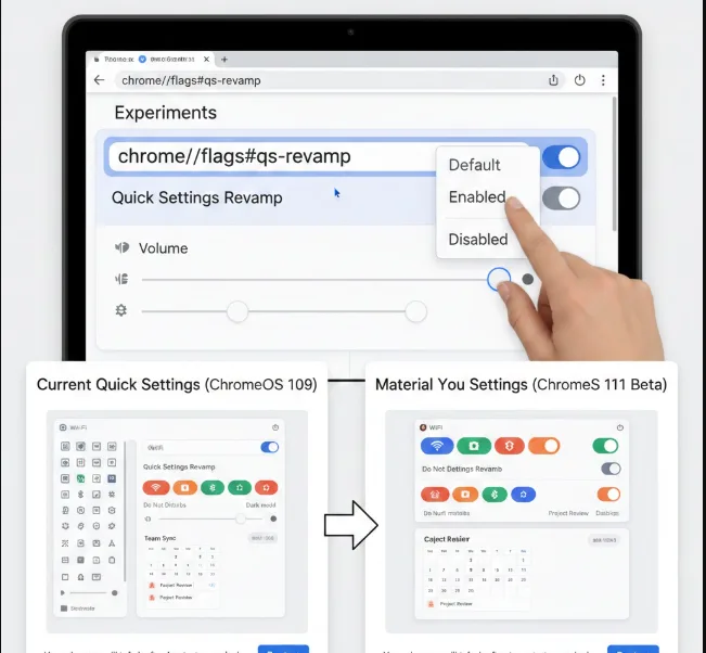
Enable the Flag
Find the dropdown menu next to “Quick Settings Revamp.” Click it and select “Enabled” from the options.
The flag controls whether your Chromebook uses the new Material You design for Quick Settings.
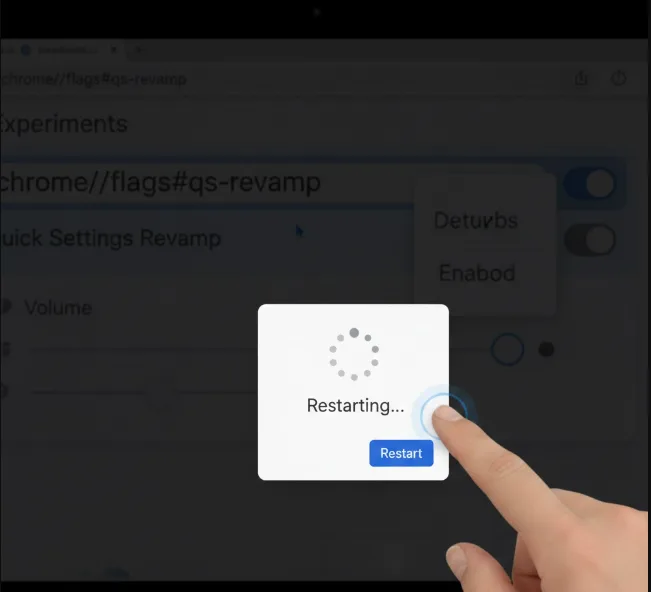
Restart Your Chromebook
Click the blue “Restart” button that appears at the bottom of your screen. Your Chromebook will reboot to apply the changes.
After restart, open Quick Settings by clicking the time in the bottom-right corner. You’ll see the new Material You interface.
The revamped Quick Settings menu isn’t as tall as the current version. This shorter height makes it less intrusive when you need to access system controls.
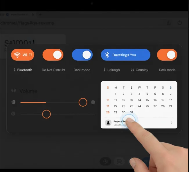
The wider layout provides another benefit beyond better button placement. The integrated Calendar uses the same screen space, giving it additional width to display event information without truncation.
This extra room helps Google designers add new Calendar features in future ChromeOS updates. The Material You redesign brings a sense of cohesion between ChromeOS and Android devices.
FAQs
What is Material You Quick Settings on Chromebook?
Material You Quick Settings is Google’s redesigned system control menu for ChromeOS. It features larger buttons, cleaner layout, and a wider interface that matches Android’s design language.
Which ChromeOS version supports Material You Quick Settings?
The Material You Quick Settings menu works on ChromeOS 111 Beta Channel and possibly version 110. The feature requires enabling an experimental flag in Chrome.
Can I customize which buttons appear in Material You Quick Settings?
Currently, you cannot customize button placement in Material You Quick Settings. Google may add customization options in future updates as empty space suggests room for personalization.
Will enabling this flag affect my Chromebook’s stability?
Enabling Chrome flags activates experimental features that may cause instability. Back up important data before enabling flags, especially on Beta or Dev Channel builds.
How do I disable Material You Quick Settings if needed?
Return to chrome://flags#qs-revamp and select “Disabled” from the dropdown menu. Restart your Chromebook to revert to the original Quick Settings interface.