Close Menu
    Facebook X (Twitter) Instagram
    • About
    • Privacy Policy
    • Write For Us
    • Newsletter
    • Contact
    Instagram
    About ChromebooksAbout Chromebooks
    • News
      • Reviews
    • Business
    • How to
      • IP Address
    • Apps
    • Q&A
      • Opinion
    • Podcast
    • Gaming
    • Blog
    • Contact
    About ChromebooksAbout Chromebooks
    Home - News - Chrome OS 76 improves tab information visuals on Chromebooks
    News

    Chrome OS 76 improves tab information visuals on Chromebooks

    Kevin TofelBy Kevin TofelMay 17, 20192 Comments2 Mins Read
    Share
    Facebook Twitter LinkedIn Pinterest Email

    Chrome OS 76, due out in August on the Stable Channel, is shaping up to bring several user interface improvements. On Thursday, I discovered that the “Clear all” notifications option is moving from the bottom to the top of the notification stack, for example. And today, I see a key improvement relating to browser tabs in Chrome OS 76 when using the latest Canary Channel build.

    First, let’s take a look at the information you get from Chrome OS when hovering over a browser tab in Chrome OS 74.

    Chrome OS 74 browser tabs
    Chrome OS 74 Stable Channel

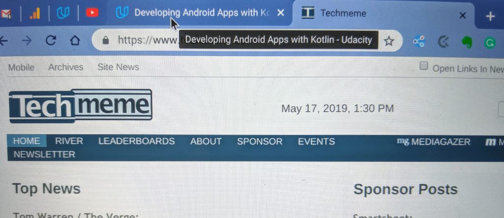
    It’s sort of ugly, no? To me it’s like the first implementation Google attempted to provide useful data. Sadly, it’s been this way for quite some time.

    Now take a peek at how browser tab info appears in Chrome OS 76 Canary Channel when hovering over a tab:

    Chrome OS 76 Canary Channel

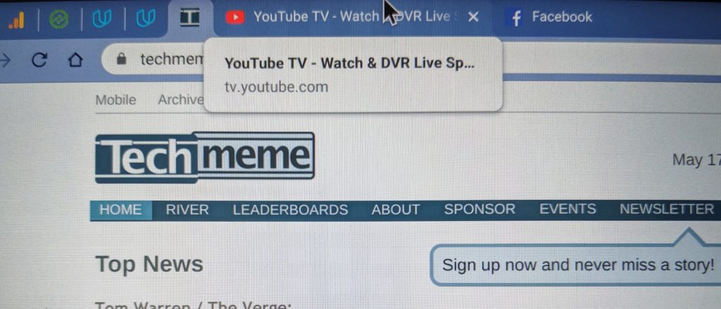
    While there really isn’t any additional information it looks so much more profession from an OS and user experience perspective. Granted, for folks who don’t keep many tabs open at one time, this isn’t likely a big deal. But if like me, you end up with several dozen tabs, the newer display is much better, particularly if you pin many of your tabs.

    Sure, this is a very small tweak of the user interface. And it’s more of Chrome OS catching up to other platforms than breaking new ground.

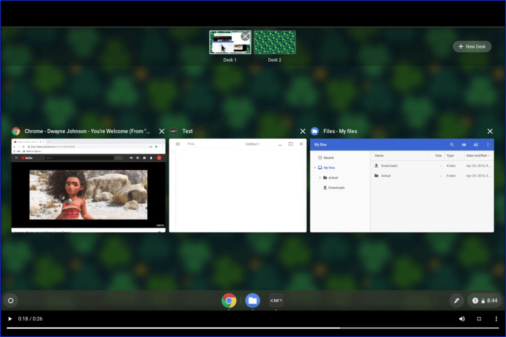
    Still, it’s becoming clear that while new functions and features are in the works for Chrome OS, developers are taking the time to improve the interface (such as with Virtual workspaces shown below) for a better overall experience as well.

    Browser tabs Chrome browser Chrome OS Chrome OS 76 User interface UX
    Share. Facebook Twitter Pinterest LinkedIn Tumblr Email
    Kevin Tofel
    • Website

    After spending 15 years in IT at Fortune 100 companies, Kevin turned a hobby into a career and began covering mobile technology in 2003. He writes daily on the industry and has co-hosted the weekly MobileTechRoundup podcast since 2006. His writing has appeared in print (The New York Times, PC Magazine and PC World) and he has been featured on NBC News in Philadelphia.

    2 Comments

    1. Chris on May 18, 2019 6:23 am

      Except it now truncates the title so loses practical value (in the example shown above).

    2. Greygeek on May 29, 2019 6:36 pm

      Not a bad thing. I was hoping from the Title that this meant more themes where the “active” tab was somehow made to be more visible (very contrasting color, or flashing, or something else. On a small screen, with many tabs open, it is a real pain sometimes to see the tab that is active.

    Top Posts

    How Good Are Chromebooks for Gaming?

    June 13, 2025

    The Ethics of Using Free Proxies for Web Scraping Projects

    June 13, 2025

    Using chrome://settings/content To Manage Protected Content

    June 13, 2025

    How to Change Brightness on Chromebook?

    June 12, 2025

    How to Connect Nintendo Switch to Chromebook 

    June 12, 2025
    • About
    • Privacy Policy
    • Write For Us
    • Newsletter
    • Contact
    © 2025 About Chrome Books. All rights reserved.

    Type above and press Enter to search. Press Esc to cancel.