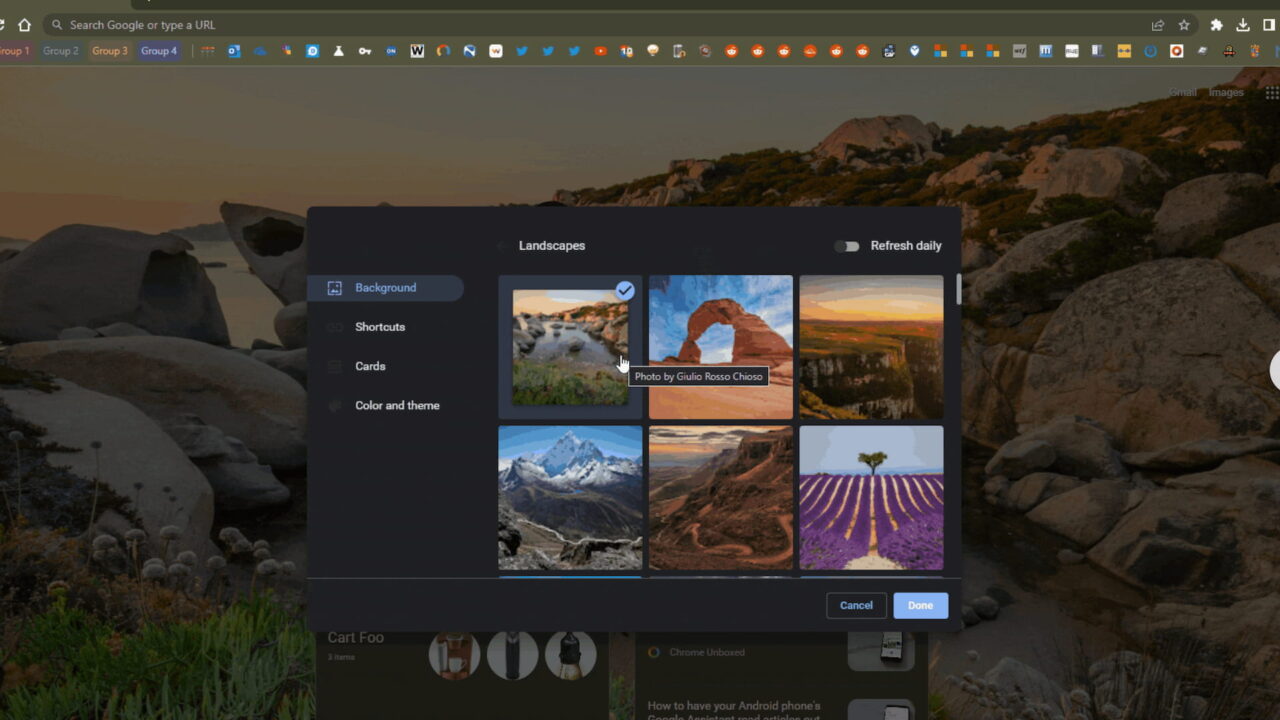
Android 12 brought what Google calls Material You, a theming feature that changes your phone interface colors to complement the background wallpaper colors. We’ve known since June that Material You Chromebook theming is coming. And now we have an idea when thanks to Leopeva64 on Reddit. ChromeOS 110 adds Material You Chromebook theming.
To be clear, this is an experimental, in-progress feature on the ChromeOS 110 Canary Channel. I see the flags to enable it in ChromeOS 109, but they have no functionality. So for everyone running the latest Stable Channel of ChromeOS, you’re looking at around three months before Material You Chromebook theming arrives.
That said, the feature is what you’d expect and looks nice in its early stages.
Here’s an animation of how your new tab page colors and interface change when picking different wallpapers.
As a different wallpaper is chosen the Material You Chromebook theming changes the UI colors to complement or match the background.
Of course, to get this functionality you have to enable the experimental flag at chrome://flags#customize-chrome-color-extraction flag. That’s the secret sauce that analyzes the background colors to create the Material You theming colors.
The chrome://flags#ntp-enable-comprehensive-theming flag appears to be how the theme changes, based on this code.

I’m guessing many Chromebook users have Android phones, so they may already be familiar with Material You. I am not one of those users.
I’m familiar with Material You, of course, but I use an iPhone. So my handset doesn’t have such personalized customization. And I can live with that.
But I do find Material You Chromebook theming to be something I would use. Maybe it’s because I use my laptop far more than my phone? I’m curious to hear from Android users on what they think of Material You. And from general Chromebook users: Is this a feature you’re looking forward to?


2 Comments
I am far in the minority on this, it seems: Material You theming does absolutely ZERO to make my life better on my Pixel phone. From a programming/technological perspective, it’s one of the coolest ideas I’ve ever seen implemented. But it’s all form and no function. I have vision impairment, and it’s just something else I have to deal with to make the phone useful.
And sure, I can kind of turn the theming off, but I’m still forced to choose one of their super-bright colors to work as text (that’s okay) AND background text highlight (blinding, almost unreadable). MS Windows isn’t great in this accessibility area (one color to rule both text and highlight), but at least I can adjust the color used to something suitable. For highlight, I need 40-60% brightness, and ALL of their proffered colors appear to start at 80%, with most being 90-95% brightness. Again, form over function.
Unless I game Google’s Material You theming system by getting a custom wallpaper that would force their system to play nice with my issues. But how much work is that going to require just to make the phone really useful? And I have the skills to work on it, but not in my current health condition.
Rather than fix or complete Really Useful Things, like universal dark mode/theme apps across the board, though (they’re what, 25% of the way there?), they are doubling, tripling, quadrupling down on Material You theming everywhere, providing zero help or use. And I’m sad that their plan appears to be to extend this theming to inside apps, where I’m sure it can be turned off from the default on setting — but it will have to be done on a per-app basis (I only say this because so many of Google’s Android decisions over the past couple of years appear to be user-hostile in nature).
Bout time