
Update: The developer assigned to this effort kindly shared more information about it. There isn’t a change of icons in the works, after all. This is to fix a bug so that all icons appear the same. He says: “The intended design for ChromeOS is that icons for all app platforms will be indistinguishable, which I know isn’t what the author was hoping for. It is intended to reflect that users should not need to know or care what platform an app was written on, they should just be “apps”.” The original post continues below.
A new developer effort to help differentiate between web and other apps on ChromeOS is in the works. The feature request was added to Google’s queue on March 30 but coding hasn’t started yet. However, today the request was assigned to a developer. The change as it’s now proposed will use squircles for ChromeOS web app icons. I don’t think that’s the way to go.
Users are unsure of what platform their ChromeOS apps are from
Overall, this is very good news for the ChromeOS-iverse. It will address one of the most often complaints I’ve heard from people over the past six or seven years. That complaint is not being able to tell if an app installed on a Chromebook is native, web-based, or Android.
I personally don’t have this complaint because I gravitate towards web apps over the Android version in the Google Play Store. So I don’t have two YouTube apps, like some people do, for example. I have one version of it and I know it’s the web app because I installed it as a PWA, or Progressive Web App. Clearly it’s a ChromeOS web app and there’s no duplication or confusion to me in this case.
But I understand the issue that people have.
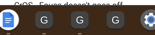
Here I installed the YouTube Android app on my Chromebook and yes, it is confusing to have two versions in my Launcher:
Addressing this confusion with icons to differentiate web apps is helpful.
However…
This ChromeOS web app icons solution feels backwards to me
While I fully support using different icons for web apps, I don’t think Google should use the squared circle, or “squircle” approach here. And I have a logical reason for my stance.
Back in 2019, Google changed the Android icons in the Google Play Store. It then became mandatory to have Play Store app icons use rounded corners, i.e., squircles. And by “mandatory” I mean that Google would automatically convert the old circular icons to squircles. Developers could upload new Android app icons to fulfill the requirement but Google made the changes if that didn’t happen.
That design language is still in place today.
Hit up the Google Play Store in ChromeOS and you’ll see app icons in squares with rounded circles.
Here’s the thing. If Android app icons universally use squircles, why use the same design for ChromeOS web apps?
That solution is completely backwards and inconsistent between Android and ChromeOS. Instead, I’d think ChromeOS web app icons should be full circles, like they are today in the Launcher. It’s really Android apps on Chromebooks that should have the squircles, no? That would bring cohesiveness between Android on phones and tablets and Android on Chromebooks.
Hopefully, Google considers this before making the change to ChromeOS web app icons. I’ve starred the issue and will watch for progress. If it looks like Google is going with squircles for web apps, I’ll leave a comment suggesting Google rethinks the approach. Let’s not make one thing less confusing by making it more confusing!
Updated April 28, 2022, 8am EDT
17 Comments
The real issue here is how AWFUL circular icons are and look. Both Android apps and PWAs shouldn’t have any background rather than the icon itself as they used to be in the past.
I think all the app I be should be circles, but the Android apps should have a frame or silhouette outline to them.
OK, so when I first read this, the implication was that “squircles” for Web/PWA app icons was a foregone conclusion and it was just a question of when. Then I read it again. No apparent decision has been made regarding how Google plans to distinguish between Android apps and Web/PWA apps. So, the message is actually that you’re very, very suspicious (nearly paranoid) that Google will make the most obviously wrong choice; so, you’ll be watching them like a hawk, ready to pounce as soon as they make a decisive move in that wrong direction. I can appreciate that. Based on some of my own past observations, someone needs to do that.
No one in charge at Google, behind on AI, Edge better browser, stadia a joke. When Microsoft betters you once, maybe it luck, but it so many times now its embarrassing. Microsoft who from 95-2015 didn’t get anything right now besting Google……
I would just prefer to see a small “w” or “WA” incorporated into the icon.
I agree that differentiation between PWAs and Android apps is good.
I don’t really care which way it goes, but I don’t agree with Kevin’s logic.
Just because squircles are used in the Play store for android doesn’t mean they should be used for Android apps on Chrome OS.
On stock Android phones, Android apps are in circles, not squircles. So at present, Android apps are in circles on both Android and ChromeOS, despite how they show in Google Play.
If the choice was mine though, I’d be wanting to consider PWAs as the ‘default’ along with things that natively come with ChromeOS – so keep them as circles, but add an A to the icon for Android apps… and perhaps an L to the icon for Linux apps.
Ill take this or any method to slowly get rid of the lazy and ugly rounded icons on chrome os. They look good on android because those designers actually know what the heck their doing. but on chrome os, even if they take the same lazy approach to unify the icons, it’s bound to look better with squircles.
App icon shapes on Android depend on the manufacturer. Google uses circular icons on the Google Pixel (and on many devices following AOSP), while Samsung uses rounded squiricles (something in between circular and Google’s definition of “squiricle”) on their launcher.
“If Android app icons universally use squircles, why use the same design for ChromeOS web apps?”
App icon shapes on Android vary by manufacturer, and typically doesn’t follow how the Google Play Store shows it. Google uses circular icons on the launcher on the Pixel (and on many devices following AOSP). Samsung on the other hand uses rounded squiricles.
I’m mostly indifferent about any changes made so long as PWAs remain first-class citizens in ChromeOS land. Android (ARCVM) and Crostini apps are the odd ones out, and I do not like being unable to distinguish at a glance an app needs to spin up a VM to run from one that runs “natively” as a webapp.
I agree with you Kevin.
Is there a link where we can upvote your suggestion?
BTW
I actually see three icons for many of my apps. One each for the webapp, PWA, and the Android app. I’m always left guessing to varying degrees.
https://postimg.cc/zbkVPTrL
I agree with the person that pointed out that not only Android apps present this issue. It also applies to Linux apps. It may even eventually apply to Windows apps as well. When presented with any dilemma, Google should just get into the habit of first asking, “What would Apple do?” That’s probably what Microsoft has been doing.
I do think we need a way to differentiate. But I strongly think all the icons should be the same shape, or else it’s going to look like a mess in the dock.
Maybe badges… and only if the user has multiple of a particular app? (Not sure if that’s detectable.)
But you know what’s more of a downgrade? Not welcoming changes 🙂
I prefer different styles for Android and Web apps.
I use both the Android and Web version of Google Photos, Drive and Calendar, because both versions have their pros and cons.
I really would to be able to identify them by the look.
I only have a couple PWAs installed, both from the address bar.
I don’t even know how to distinguish a PWA when searching for apps, Android, or Chromebook.
From my perspective the shape of the icon is smaller problem than actually finding a PWA.